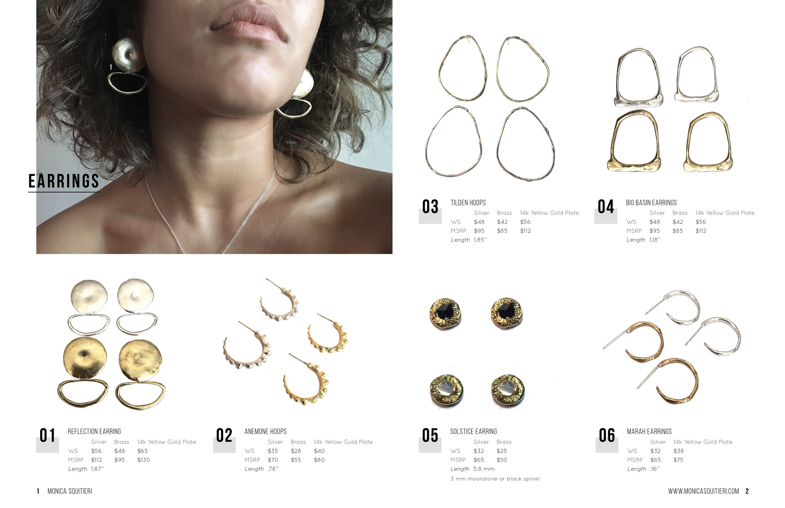
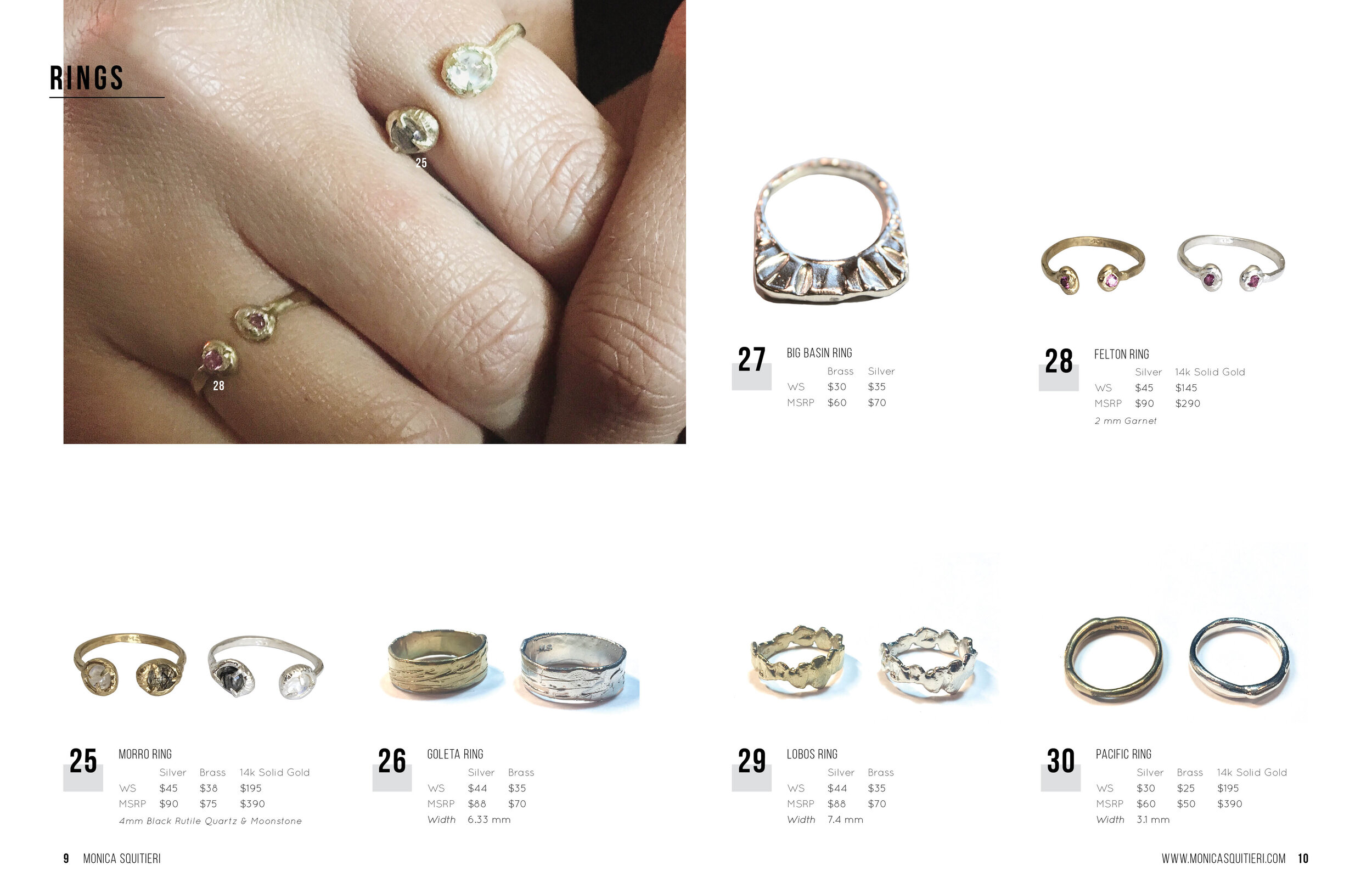
1586 21 Ave.
San Francisco, CA
805.215.9099
Sheena McNeal
Your Custom Text Here
Your Custom Text Here
Designed catalog and retouched images for this clean aesthetic.
Redesigned this 18 page guide so that it mirrored Adobe’s style guide. Created info graphics and icons.
I am responsible for creating the Weekly Wow posters, highlighting the 50% off merchandise each week.
I have created print ready files for in-store fixtures across several different categories of stores.
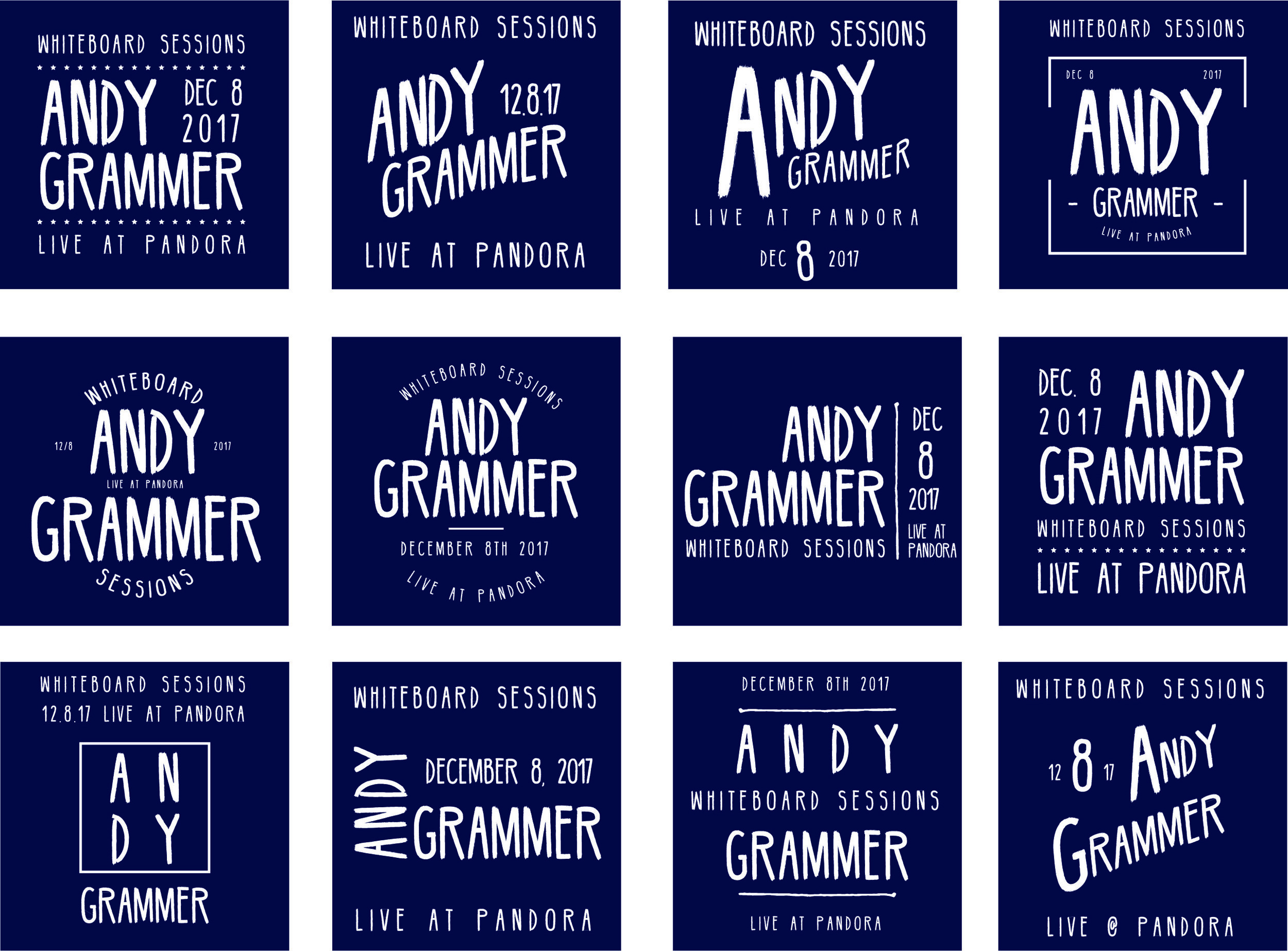
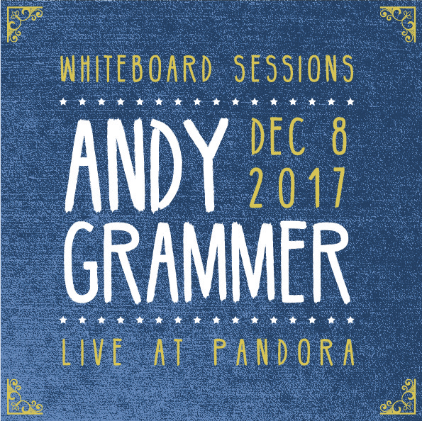
This was a typography exercise: before I landed on the right lock-up, I explored various hierarchies of information and how to present it.
The final design highlights the artist's performance. Background colors and textures were influenced by his homepage:
http://andygrammer.com/
Susanne Sundfor is an artist from Norway so I reflected her heritage in this Nordic font.
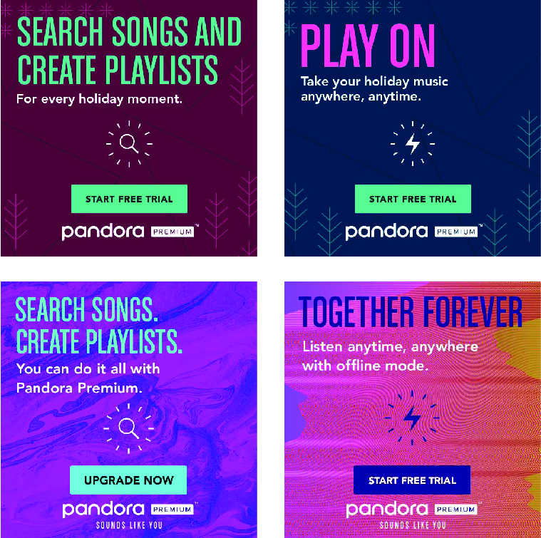
These are some examples of house ads for Pandora. The tiles are small so it is important to focus on color contrast, legability and alignment.
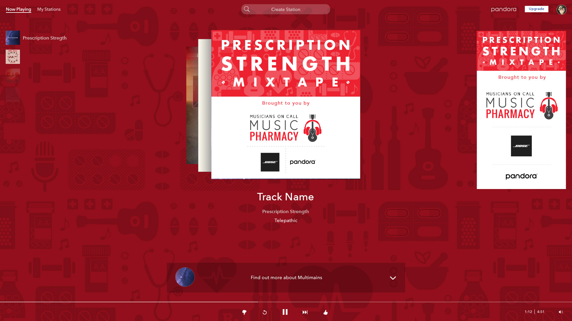
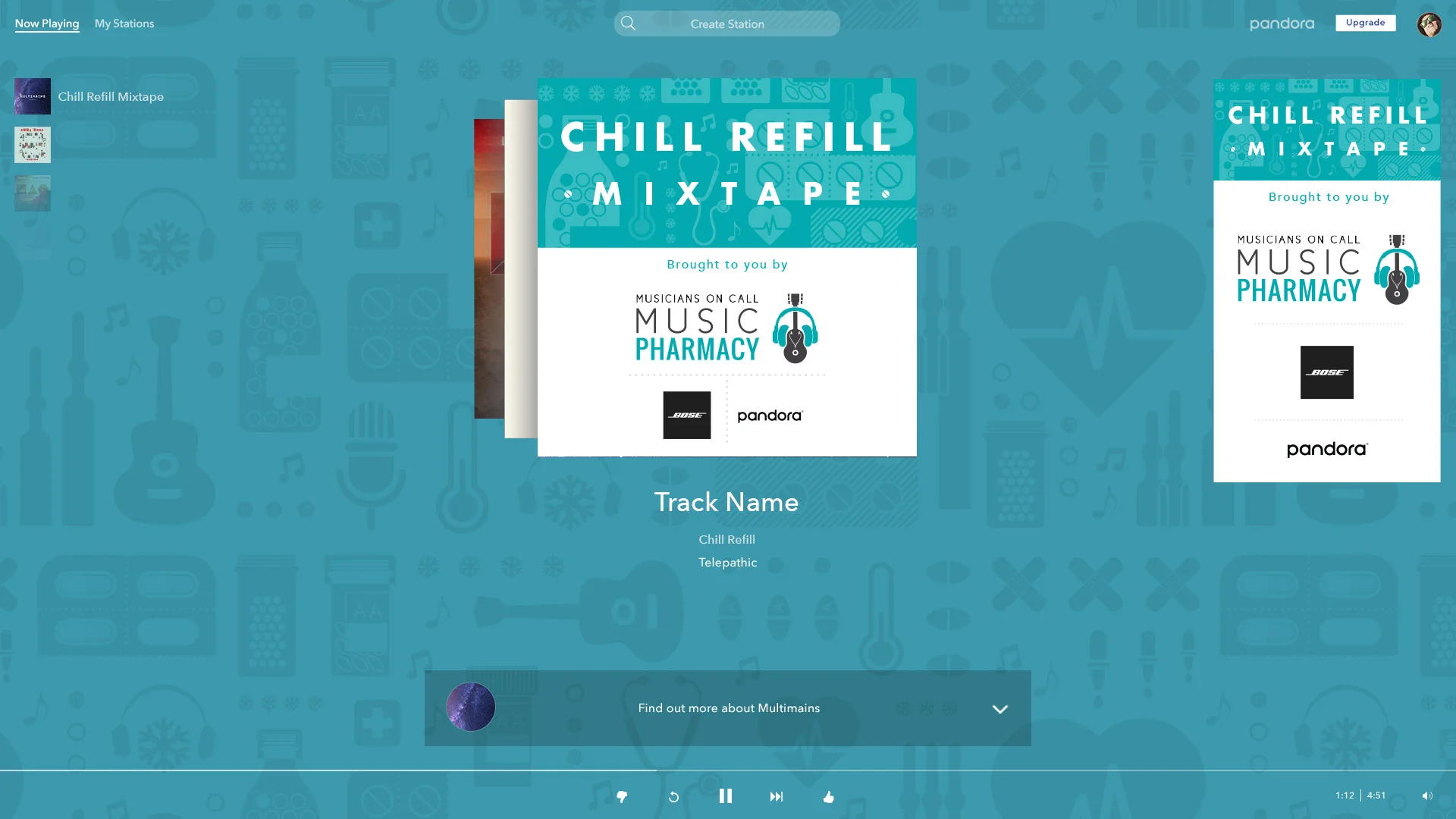
Pandora Gives donated 4 custom mixtapes to one of our primary nonprofit partners, Musicians on Call. These mixtapes will be distributed to 29 partner hospitals on donated tablets and Pandora Plus accounts. MOC wanted the branding to incorporate imagery to tie it back into a "pharmacy" theme without sacrificing the positivity, & strength. I developed this 4 color system and unique icons to create a pattern that is similar but unique to its respective mixtape. The client liked the repeating pattern so much, they decided to incorporate it into their gift wrap.
I created mocks so that the client could see how the elements came together across mobile, tablet and the web.
Implemented large-scale signage across multiple surfaces of Moscone Center.
Exploring different ways to celebrate servers.
89 x 117" wall designed for FitBit's Group Health chapter to encourage other companies to start a wellness program.
I created mechanicals for interactive point of purchase displays for stores across the US and Canada. Bilingual versions were created as well as various sizes depending on retailer's requests.
This display helps customers decide which product is most suited for their needs.
Fitbit offers a variety of accessories and bands. This wall highlights some of these options provided in the store.
I created hangtags for Pottery Barn's lamp collection.
2 page layout for Splacer highlighting potential creative spaces for rent.
After visiting the Olympic National Rainforest I wanted to create a collage of my photographs. Nothing says value like a diamond.
I love taking a single motif to create graphic compositions that freely play with color, image size, rhythm and proportion. I invite you to get lost in an infinite sea of shapes, discover what motifs are repeated or delight in the structure and symmetry of my original work.
I created this pattern to distinguish, yet give specific personalities to the set of mix-tapes for Musicians on Call. Each set shares the same pharmacy themes but also has 2-3 standout icons to represent its specific collection: chill refill, dose of joy, prescriptions strength and stars & stripes.
I have created several patterns for swimoutlet.com. The sushi pattern is their best seller & was featured in Triathlete Magazine’s 2011 Holiday Gift Guide.
This collection was inspired by Disney’s It’s a Small World. I wanted to capture Mary Blair’s whimsical, yet graphic style.This sampling represents some of the patterns created for a young girl’s room.
In nature we find an infinete range of colors, a vast diversity of shapes and countless stories. I created this whimsical collection for the nature lover in us all. Sold through roomsbyyou.com
Part of what makes a room come together are the textiles and visualizing a finished room can be difficult for a lot of folks. Rooms By You provided tools to allow you to enter a room staged with furniture and all white textiles: bed linens, wall art, lamp shades, curtain panels, etc. I provided 6 collections containing about 20 different coordinating surface pattern designs that users could drag and drop in any configuration that they choose into all of the textile related products in the room. Each collection had several different colorways to give the customer a vast array of options. This is a snapshot of a room a customer created using the 3D customization tool from the website.
Rooms by You
This collection was inspired by what most boys are obsessed with: planes, trains and automobiles.
Nautical elements come together in this bold and graphic collection for Rooms by You.
I have developed private label products for major retailers. The process starts with vector art and a photoshop mock-up. If it gets approved files are set up for a factory in China to carry out the execution of production.
Flat vector art
Example of photoshop mock-up
Factory-ready file
Photoshop is my favorite magic trick. It allows me to freely manipulate images, colors and light using a variety of tools without restriction. Abracadabra!
Retouching for Pottery Barn Kids.
I hope!
Sample EDM I created for BevMo!
Diamonds are made up of carbon molecules. Carbon appears in 90% of molecule type detected between stars so I call this piece Diamonds in Space!
Dreaming about summer and watermelon.
I used Irving Penn's wilting poppies to create this collage for a friend.
Samastitihi: means equally a call to action and standing in balance.
Screen prints are beautiful by virtue of their irregularity. Smudges of ink and the layering of graphics echoes life with its multiple levels, rich textures and often ragged edges. It is through the use of my hands that I hope to make my work felt.
2 color job. enjoy is my mantra.
I enjoy poetry and antiquated technology. I adore my portable victrola.
I participated in the Lifecycle ride from San Francisco to Los Angeles. I made these handkerchiefs as a token of appreciation for my sponsors.
I'm attracted to the 1890's ideal feminine figure represented by the Gibson Girls. They were seen as an example of change within the old patterns of social order, asking for the right to equal educational and work opportunities as well as progressive reform, sexual freedom and suffrage.
I designed and printed my sister's wedding invitations. The thin serifs were quite challenging with my not-so-fine mesh screens.
Lasers can burn or cut graphics into almost any material. Here are some of my experiments.
I am bringing beautiful typography to the cake topper industry. Still experimenting with materials, but found that .125" Baltic Birch ply provides stability. Now what color to paint it?
Where the laser really shines is in the details, and a little glitter always helps.
Once again, I wanted to show off the level of detail you can attain using lasers and matt board. Here I drew a silhouette of Baba Yaga flying in her mortar, wielding her pestle, chasing after her hut which walks around on chicken feet.
Photograph of a sea urchin burned into Birch ply
Double exposure photograph: Man in the Sea
I cut coasters from a Madrone Tree branch for my material. Repeating the tree around a centered orientation created a nice mandala. I made sure the laser would burn out the negative space so more detail could be achieved in the releif.
Raster image burned on a nice piece of Sycamore.
Have more fun rolling sushi with personalized nori
Cutting fancy type proved to be a little tricky but it has given me the idea to create a font set that works more like a stencil and provides more insert points so that letter forms will not drop out of the final result.
Filling up my street-find window with laser cut paper creations.
This design was too delicate. The paper fell apart in my hands.
I enjoy making things and sometimes I just don't know what to call it but fun!
A year ago I cut a tendon in my index finger with an exacto knife. It took 9 months before it felt normal. Me & Exacto are back at it again! When you fall off the knife, climb back on its edge as they say.
Light breaks through its two-dimensional origins.
I took a neon class at The Crucible where learned how to bend glass tube, weld glass and electrodes. This is my final project in which I enjoyed exploring waves: sound and heart.
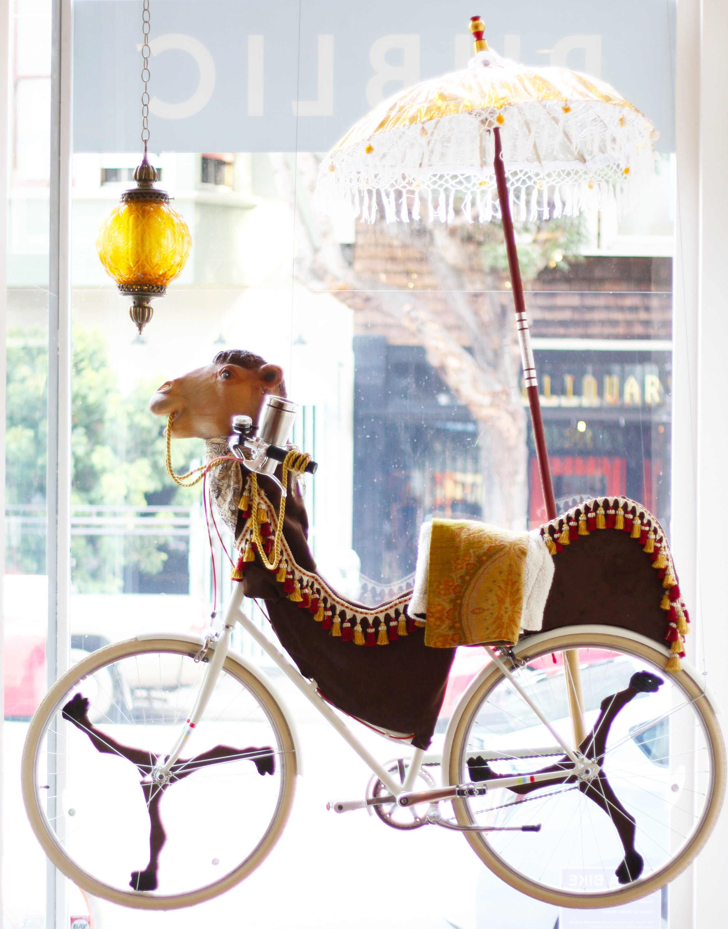
I was asked to create a Burning Man bike for Public Bike's August window. The theme for the event was Caravansary so I thought a camel that provided some shade would be appropriate.
I sculpted these chicken feet using the lost wax casting technique. Instruction for the foundary was provided by the Crucible.
I was part of the 5 Ton Crane Art Collective that created Storied Haven: a place full of things and stories.
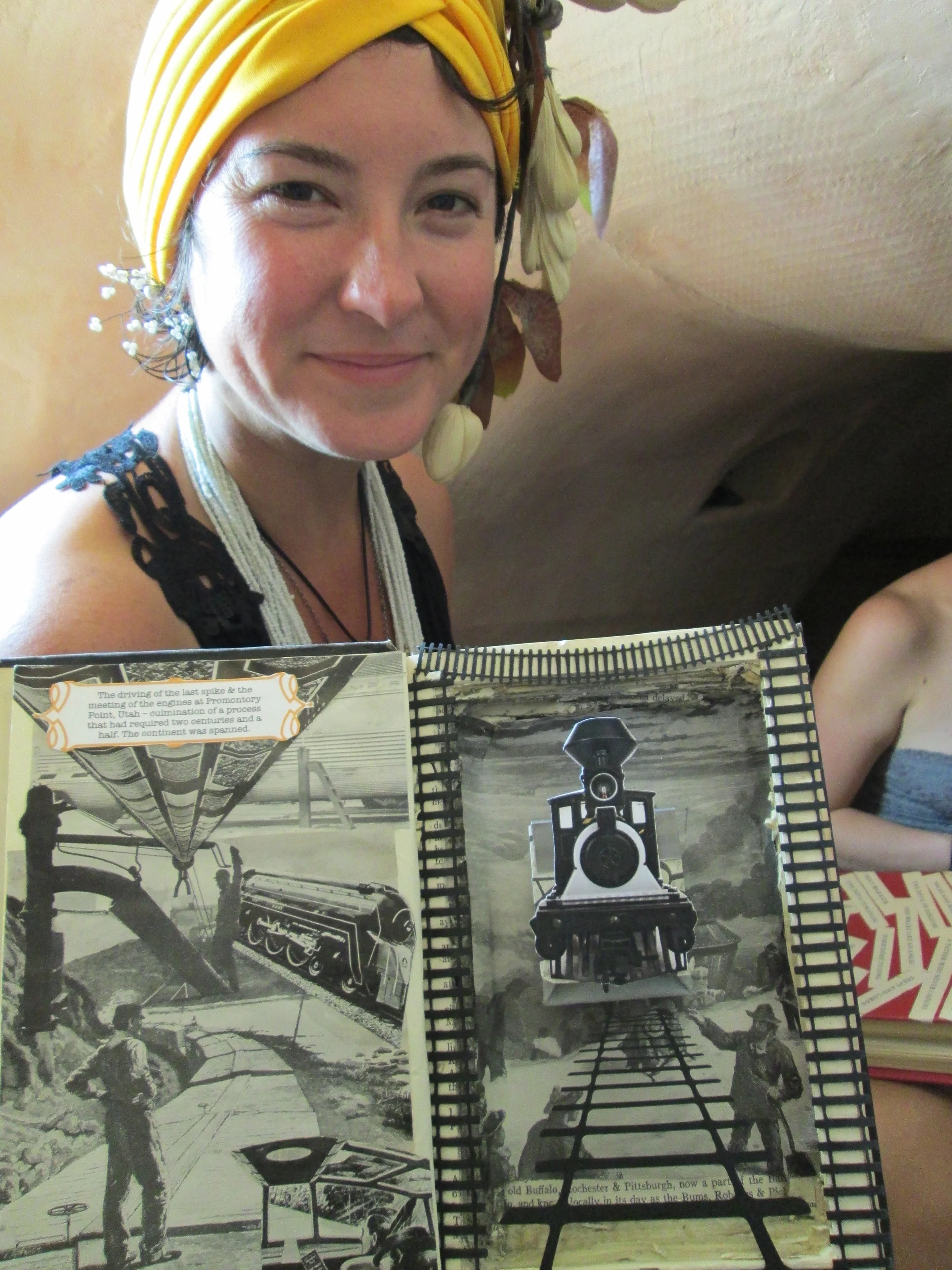
Storied Haven had a large library of books turned into dioramas: each one its own little work of art. I created this scene for "The History of American Railroads"
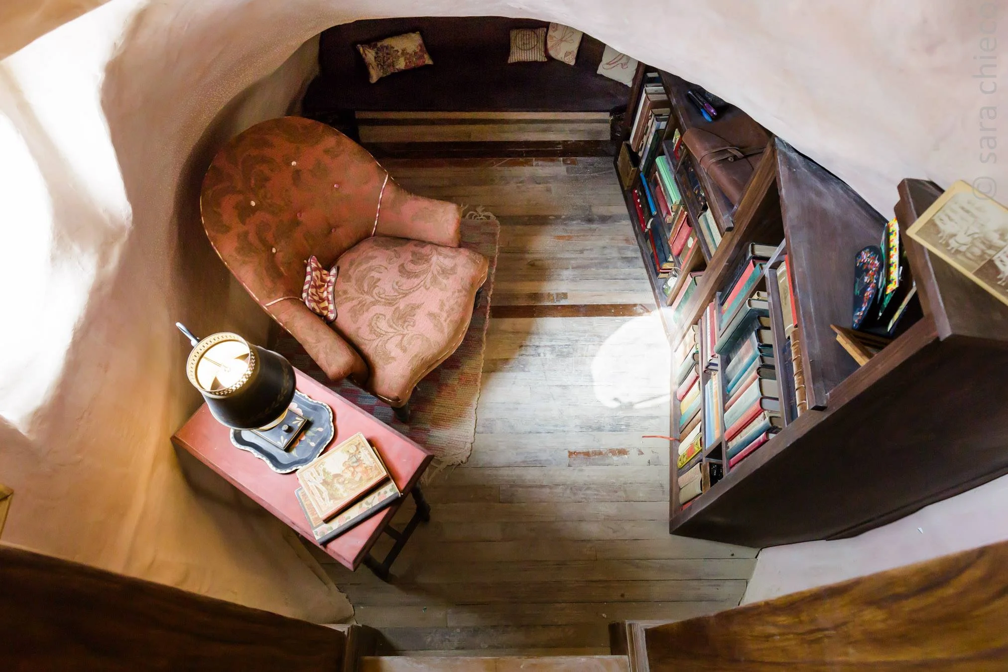
Peek into the floorboards, and you might see some mice being fancy.
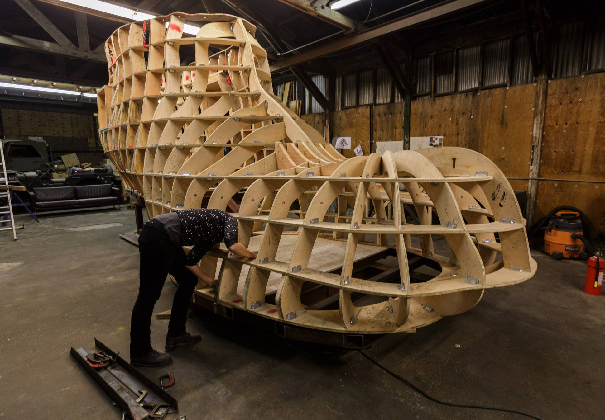
The skeleton of the boot. It would later be sanded, shaped, and get layers of fiberglass.
The initial sketch before anything was built.
I bent some of these metal poles to create the bean stalk ladder.
Interior shot of fairytale romance. Humpty Dumpty urn complete with egg shells, Rapunzel's hair and Anansi weaving her web.
Front view: there was always a line to get inside, but stories were shared and made.
Created this print by carving linoleum at 3 Fish Studios.
These digital illustrations were created with Adobe Illustrator. Enjoy!
Based on a photograph I drew several lamps which would be displayed on
Pottery Barn's hang tags.
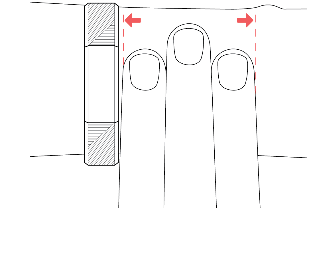
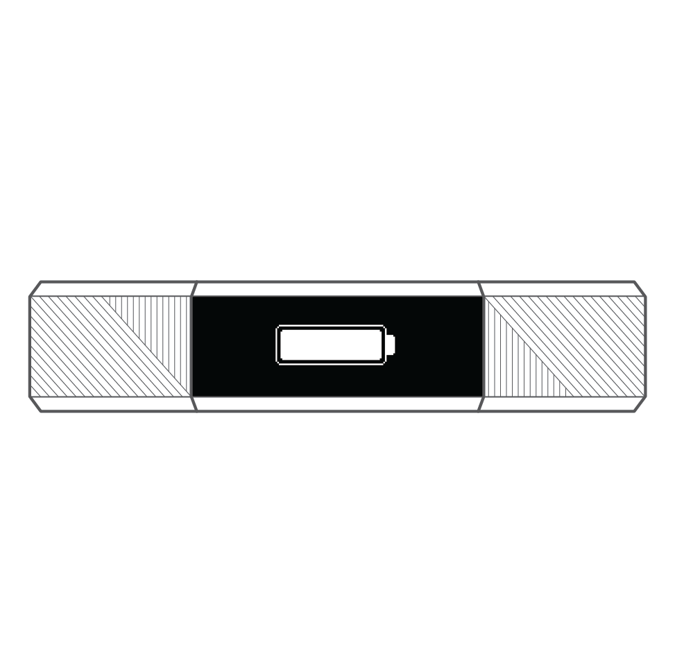
Illustrations for FitBit quick start guides
Visual instructions for charging your FitBit
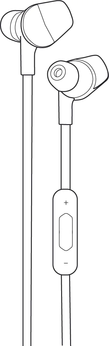
Bluetooth Headphone new product drawing
I made a lot of these. Just ask.
FitBit Blaze Metal Links Illustration used for sizing guide.
A friend told me he noticed street lights would go out in his presence. This was my response.
A galaxy of fireflies can illuminate what is hidden and bring wonder and awe in the darkness.
Looking into a fantasy of ladies, daisies & donuts.
Unicorns of the sea
Octopuses fascinate me. Can you find the three hearts hidden in their tentacles?
A Valentine inspired by DeAnne Smith's Nerdy Love Song.
Breaking it down like science!
California poppies for someone special
San Francisco skyline flowating away
Things I love: paper, ink, pretty things made by hand and Valentines. I designed these cards and printed them on a manually operated Chandler & Price from 1889. Each card was relief-printed one at a time using custom mixed inks and 100% cotton Crane's Lettra paper.
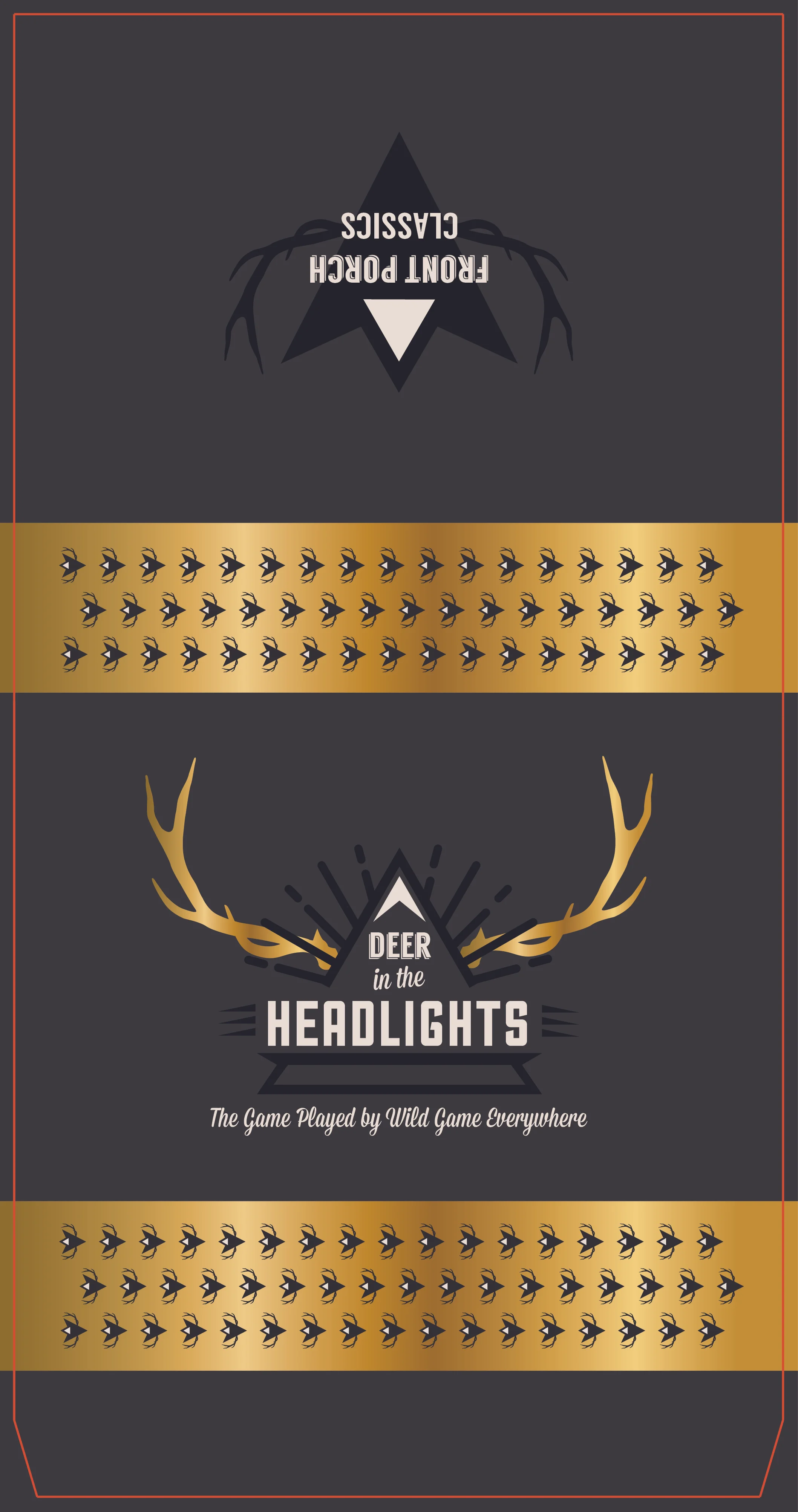
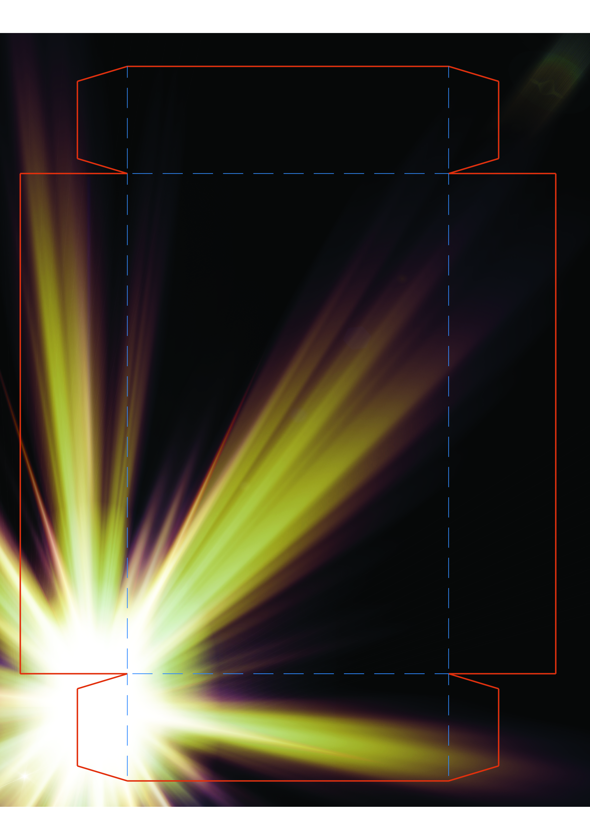
Packaging: bringing form, function and unique features together in a finished concept. I would love to expand my experience with dielines.
I worked on the production of the Alta HR packaging which comes in several colors and is distributed to over 50 countries.
Two different takes on a redesign for University Games matchbook style packaging.